Are Your Materials Telling the Same Story?
Imagine a customer visits your website and sees clean, modern branding in blue and grey. Later, they pick up your business card, which uses
different colours and fonts. Then they see your storefront signage, where the logo looks stretched or outdated. Individually, none of these
details seem catastrophic, but together they create a feeling of disconnect.
In business, especially in trust-based markets like Alberta, those disconnects matter. Customers want to know they can rely on you, and a
big part of that confidence comes from a brand that feels unified and professional. That’s why visual consistency across design, print,
and promotional materials is one of the most important, yet often overlooked, aspects of marketing.
What Does Visual Consistency Actually Mean in Marketing?
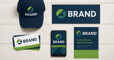
Visual consistency is the practice of making sure your brand looks the same no matter where people encounter it. It goes beyond using your
logo on everything. True consistency includes:
- Colours that match across signage, apparel, and digital platforms.
- Fonts that remain uniform in brochures, business cards, and social media graphics.
- Imagery that reflects the same tone, whether on a billboard or in a Facebook ad.
For example, if your business operates in Lacombe and Ponoka, customers should recognize your brand instantly whether they see a flyer in
their mailbox, a banner at a local event, or branded apparel on your staff. Consistency creates recognition, and recognition drives trust.
Why Does Consistency Build Trust With Customers?
Trust is the cornerstone of repeat business, and customers often build that trust subconsciously. When your branding is consistent:
-
It feels familiar. Seeing the same colours, logo, and design elements across different touchpoints creates a sense of
reliability.
- It signals professionalism. A polished, consistent look tells customers you take your business seriously.
-
It builds memory anchors. The more often people see your branding in a consistent format, the easier it is for them to
remember and recommend you.
Think about major chains, whether it’s a franchise restaurant in Edmonton or a big box retail store in Red Deer, customers know what to
expect. That same principle applies locally: when your print media, custom signage, and corporate swag line up visually, it reassures people
that you’ll deliver a consistent experience too.
How Can Inconsistent Visuals Hurt Your Business?
On the flip side, inconsistency sends signals you might not intend. Consider these scenarios:
- A promotional t-shirt uses a slightly different shade of your logo colour.
- A brochure has a different font from your website.
- An outdoor sign shows a stretched version of your logo.
Individually, they may seem minor. Together, they create doubt. Customers may wonder if your attention to detail is lacking, or worse, if
you cut corners. In industries where trust is critical, like professional services, health and wellness, or trades, those doubts can be
enough to send someone to a competitor.
Inconsistent branding also costs money. If you need to reprint signage or promotional items because they don’t match your brand, those are
resources you could have invested elsewhere.
What Does Consistency Look Like Across Design, Print, and Promotional Materials?
Consistency doesn’t mean everything must look identical, it means everything should feel connected. That connection comes from aligning
your materials through a clear set of brand guidelines.
-
Graphic Design: Ensure digital assets like social media posts, ads, and email campaigns use the same fonts, colours, and
logo placement.
-
Printing Services: Brochures, rack cards, and business cards should carry the same visual identity, right down to the
correct colour codes.
-
Custom Signage: From fascia signs in Lacombe to banners at Red Deer trade shows, signage should reinforce your brand
presence.
-
Promotional Products: Items like mugs, pens, and branded apparel should all match your established colour palette and logo
style.
When these elements work together, customers see one unified brand instead of a patchwork of mismatched pieces.
How Can You Stay Consistent Without Being Boring?
A common fear among business owners is that consistency will limit creativity. In reality, the opposite is true: clear brand guidelines give
you a framework to create confidently.
For example, a Central Alberta retailer could run a fall campaign using autumn-inspired photography while still keeping their fonts, logo,
and primary colours consistent. Or a Ponoka service company might create a holiday promotion with festive themes, but their core branding
remains intact.
Consistency is about recognition, not rigidity. When customers see creative campaigns that still feel like you, it strengthens
their connection to your business.
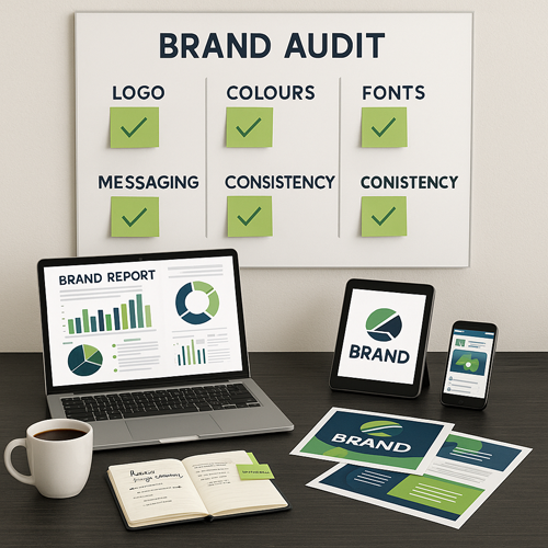
When Should You Audit & Update Your Visual Assets?
 Even
the strongest brands need regular check-ups. A good rule of thumb is to audit your materials at least once a year, or whenever you launch
a new campaign, product line, or location.
Even
the strongest brands need regular check-ups. A good rule of thumb is to audit your materials at least once a year, or whenever you launch
a new campaign, product line, or location.
During an audit, gather:
- Business cards and stationery.
- Brochures, flyers, and direct mail pieces.
- Indoor and outdoor signage.
- Apparel, swag, and promotional products.
- Digital assets like website pages and social media graphics.
Lay them out, side by side. Do they look like they belong to the same brand family? If not, it’s time to refresh and realign.
Working With a Single Brand Partner
One of the biggest challenges for small businesses is juggling multiple suppliers. Maybe your designer is in one place, your printer in
another, and your swag vendor somewhere else. That fragmentation makes consistency hard to manage.
Strand360 solves this problem by offering everything under one roof: graphic designers,
printing services, custom signs,
branded apparel, promotional products,
content creation, and brand
management.
With one partner managing your brand, you save time, reduce errors, and maintain visual consistency across every platform.
Final Thoughts: Consistency Builds Confidence
In Alberta, where relationships and reputation carry so much weight, your brand visuals are often the first impression you make.
Consistency builds confidence, helping customers trust that your business is as reliable as it looks.
From business cards and brochures to signage and swag, every touchpoint is a chance to reinforce your identity. By aligning your design,
print, and promotional materials, you show customers you’re polished, professional, and worth remembering.
If you’re ready to work on your brand’s visuals, Strand360 can help bring every piece together.
LET'S TALK ABOUT YOUR BRAND!
LET'S TALK ABOUT YOUR BRAND!

 Even
the strongest brands need regular check-ups. A good rule of thumb is to audit your materials at least once a year, or whenever you launch
a new campaign, product line, or location.
Even
the strongest brands need regular check-ups. A good rule of thumb is to audit your materials at least once a year, or whenever you launch
a new campaign, product line, or location.